📈 Metrics
See how the business is performing — revenue, payments, outstanding balances, and job throughput.
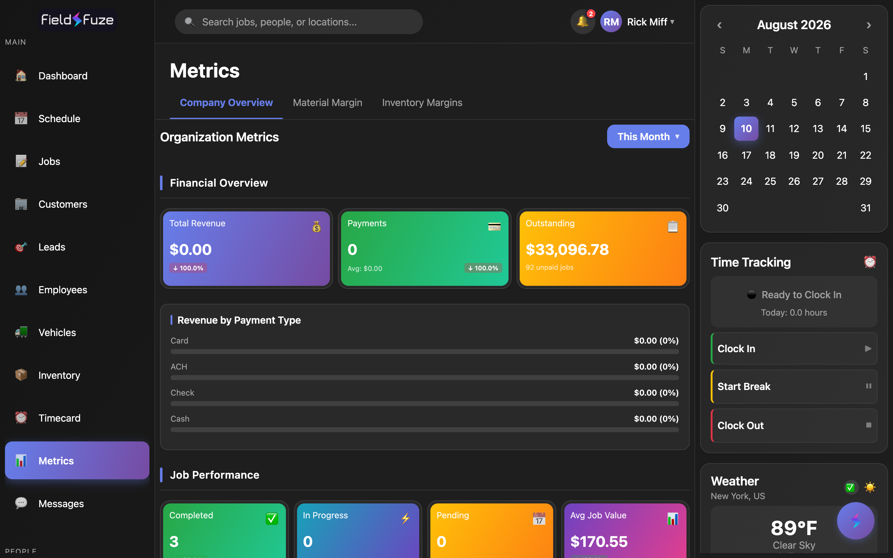
Metrics turns everything happening across your jobs, payments, and inventory into a few clear numbers you can read at a glance. It's organized into three tabs at the top — Company Overview, Material Margin, and Inventory Margins — so you can move from "how's the whole business doing?" down to "which items and which jobs make me the most money?" in a couple of taps.
Metrics is available if your role includes financial visibility. When it's available, everything on this page is at your fingertips.
Company Overview
The Company Overview tab is your business scoreboard. Pick a time period and FieldFuze recalculates every number on the tab for exactly that window, then compares it to the period right before it so you can see which way things are trending.
Pick your period
The period selector sits at the top right of the tab. Tap it to open a dropdown and choose the window you want to look at — the whole tab refreshes instantly, and a checkmark marks your current choice.
- Today — everything since midnight, for a live pulse on the day.
- This Week — from Sunday through now.
- This Month — the calendar month so far (this is the default view when you open Metrics).
- This Quarter — the current calendar quarter to date.
- This Year — January 1 through today, great for year-to-date reviews.
- Last 7 Days, Last 30 Days, Last 90 Days — rolling windows that always end today, perfect for spotting momentum independent of the calendar.
- All Time — every record on the books, for the grand total.
Financial Overview
The first band of cards is your money picture for the chosen period. Each card is a single, bold number so it reads across the room.
- 💰 Total Revenue — every dollar collected in the period, formatted as currency. A small trend badge shows how it compares to the previous period.
- 💳 Payments — the number of payments taken, with Avg: your average payment amount right beneath it, plus a trend badge on the count.
- 📋 Outstanding — the total balance still owed to you, with the count of unpaid jobs underneath so you know how many customers to follow up with.
Revenue by Payment Type
Right below the cards, a set of horizontal bars breaks your revenue down by how customers paid. Each bar shows the dollar amount and its share of total revenue as a percentage, so you can see at a glance where your money comes in.
- Card — card payments (blue bar).
- ACH — bank transfers (green bar).
- Check — checks (amber bar).
- Cash — cash payments (teal bar).
When you take payments through FieldFuze, card and bank (ACH) payments post to these bars on their own. Set up card and ACH acceptance under Payments (Stripe), and record checks and cash on the job's Billing & Payments tab so every payment type shows up here.
Job Performance
The next band counts your job throughput for the period — the operational half of the scoreboard that pairs with the financial half above.
- ✅ Completed — jobs finished in the period, with a trend badge versus the prior period.
- ⚡ In Progress — jobs actively being worked.
- 📅 Pending — jobs waiting to start.
- 📊 Avg Job Value — your average job size in dollars, with its own trend badge — a quick read on whether your typical ticket is growing.
Trend comparisons
Wherever a card carries a trend badge, FieldFuze compares your current period to the one immediately before it and shows the change as a percentage — a green ↑ when the number is up and a red ↓ when it's down. A line at the bottom of the tab spells out exactly which prior date range you're being compared against, so the comparison is always fair and apples-to-apples. Change the period and every trend recalculates against the new "period before."
Read Total Revenue and Outstanding side by side. Strong revenue with a climbing outstanding balance is your cue to work collections — tap into the unpaid jobs count and send reminders from each job's Billing & Payments tab. Rising revenue with a flat outstanding balance means the cash is actually landing.
Inventory Margins
The Inventory Margins tab shows how profitable the items in your warehouse are. As soon as an item has a unit cost, FieldFuze compares that cost to its sell price and does the margin math for you — per item, per category, and across your whole warehouse.
Summary at the top
A row of summary cards frames the whole picture before you dive in:
- Items With Cost — how many items already have a unit cost and are included in the analysis.
- Missing Cost — items still waiting on a unit cost; add one and they join the numbers automatically.
- Value at Cost — what your on-hand stock is worth at what you paid.
- Value at Sell — what that same stock is worth at your prices.
- Overall Margin — your blended margin percentage across the warehouse, color-coded so healthy margins read green at a glance.
Category Breakdown
Next, FieldFuze rolls your items up by category — Tools, Hardware, Equipment, Materials, Supplies, Safety, and Other — and shows each category's item count, total cost value, total sell value, and average margin %. It's the fast way to see which parts of your inventory carry the richest margins.
Per-Item Profitability
The main table lists every cost-tracked item with the full profit story on one line:
- Cost — your unit cost.
- Sell — your sell price.
- Margin % — the margin on that item, color-coded green when strong, amber when moderate.
- Total Profit — cost-to-sell profit across the quantity you hold, so higher-volume items rise to the top of your attention.
Sort the list any way you're thinking with the Profit, Margin, and Name buttons — lead with Profit to find your biggest earners, switch to Margin to find the richest markups, or use Name to look something up. Pull to refresh any time to pick up your latest cost and price changes.
Add a unit cost to your items on the Inventory screen and each one moves from Missing Cost into the analysis, sharpening your Overall Margin. With costs in place you'll know at a glance which materials to keep well-stocked and which prices have room to grow.
Material Margin
The Material Margin tab shows your per-job material profit — the profit built into the materials on each job, so you can see which work pays the best on materials alone. It fills in as you cost-track inventory: add unit costs to your inventory items and use those items in your estimates, and completed jobs start reporting their material margin here automatically.
- Add a unit cost to your inventory items on the Inventory screen.
- Use those cost-tracked items as line items in your Estimates, so each job carries both its cost and its price.
- As those jobs complete, this tab reports the material profit on each one — your sell price for materials minus what they cost you.
This tab focuses on material profit so the number stays clean and comparable across jobs. Pair it with Company Overview's Avg Job Value and the Inventory Margins tab for the complete picture — from a single item's markup, to the materials on one job, to the whole business.
Once material margin is flowing, you can spot which types of jobs — and which materials — deliver the strongest returns, then steer more of your estimates toward the work that pays. It rewards good habits: the more you cost-track in Inventory and carry those costs into Estimates, the richer this view becomes.